Corporate Website
Axeller Revops
Axeller Revops
Designing a compelling web presence for a premier outsourcing services firm that helps businesses scale without losing their identity — translating a bold brand promise into a credible, conversion-focused website.
Designing a compelling web presence for a premier outsourcing services firm that helps businesses scale without losing their identity — translating a bold brand promise into a credible, conversion-focused website.
Year
Year
2026
2026
Role
Role
UX/UI Designer
UX/UI Designer
Tools
Tools
Figma
Figma
Audience
Audience
Companies looking for outsourcing services
Companies looking for outsourcing services
The Problem
Axeller Revops positions itself as a premier provider of outsourcing services — a company that promises to help businesses grow at scale without compromising their unique identity. The challenge was to design a website that lived up to that promise: professional, credible, and immediately trustworthy to the decision-makers and business owners who would land on it.
The target audience consists of companies actively evaluating outsourcing partners — visitors with high intent who need to understand the value proposition quickly and feel confident enough to reach out. The site needed to balance clarity of messaging with a strong visual identity that set Axeller apart from generic service providers.
Axeller Revops positions itself as a premier provider of outsourcing services — a company that promises to help businesses grow at scale without compromising their unique identity. The challenge was to design a website that lived up to that promise: professional, credible, and immediately trustworthy to the decision-makers and business owners who would land on it.
The target audience consists of companies actively evaluating outsourcing partners — visitors with high intent who need to understand the value proposition quickly and feel confident enough to reach out. The site needed to balance clarity of messaging with a strong visual identity that set Axeller apart from generic service providers.
Axeller Revops positions itself as a premier provider of outsourcing services — a company that promises to help businesses grow at scale without compromising their unique identity. The challenge was to design a website that lived up to that promise: professional, credible, and immediately trustworthy to the decision-makers and business owners who would land on it.
The target audience consists of companies actively evaluating outsourcing partners — visitors with high intent who need to understand the value proposition quickly and feel confident enough to reach out. The site needed to balance clarity of messaging with a strong visual identity that set Axeller apart from generic service providers.
My Role
I led the full UX/UI design of the website from concept to final prototype. My responsibilities included defining the information architecture, designing the visual language and component system, and producing high-fidelity interactive mockups in Figma ready for developer handoff.
The scope covered all key pages: the homepage (hero, services overview, value proposition, social proof, and CTA sections), service detail pages, and the contact page — ensuring a coherent narrative from first impression to conversion action.
I led the full UX/UI design of the website from concept to final prototype. My responsibilities included defining the information architecture, designing the visual language and component system, and producing high-fidelity interactive mockups in Figma ready for developer handoff.
The scope covered all key pages: the homepage (hero, services overview, value proposition, social proof, and CTA sections), service detail pages, and the contact page — ensuring a coherent narrative from first impression to conversion action.
I led the full UX/UI design of the website from concept to final prototype. My responsibilities included defining the information architecture, designing the visual language and component system, and producing high-fidelity interactive mockups in Figma ready for developer handoff.
The scope covered all key pages: the homepage (hero, services overview, value proposition, social proof, and CTA sections), service detail pages, and the contact page — ensuring a coherent narrative from first impression to conversion action.
Process
Discovery
Discovery
01
Stakeholder alignment session to define brand tone, target audience, competitive positioning, and conversion goals.
Stakeholder alignment session to define brand tone, target audience, competitive positioning, and conversion goals.
Architecture
Architecture
02
Defined site structure, content hierarchy, and user flow from landing to contact — minimizing friction to the key CTA.
Defined site structure, content hierarchy, and user flow from landing to contact — minimizing friction to the key CTA.
Wireframes
Wireframes
03
Low-fidelity layouts to validate structure and content placement before investing in visual design.
Low-fidelity layouts to validate structure and content placement before investing in visual design.
Visual Design
Visual Design
04
Built a cohesive visual system — typography, color palette, components — reflecting Axeller's premium positioning.
Built a cohesive visual system — typography, color palette, components — reflecting Axeller's premium positioning.
Prototype
Prototype
05
Delivered interactive high-fidelity prototype in Figma with all states, hover effects, and responsive layouts for dev handoff.
Delivered interactive high-fidelity prototype in Figma with all states, hover effects, and responsive layouts for dev handoff.
Key Choices
Lead with the brand promise, not the service list
Lead with the brand promise, not the service list
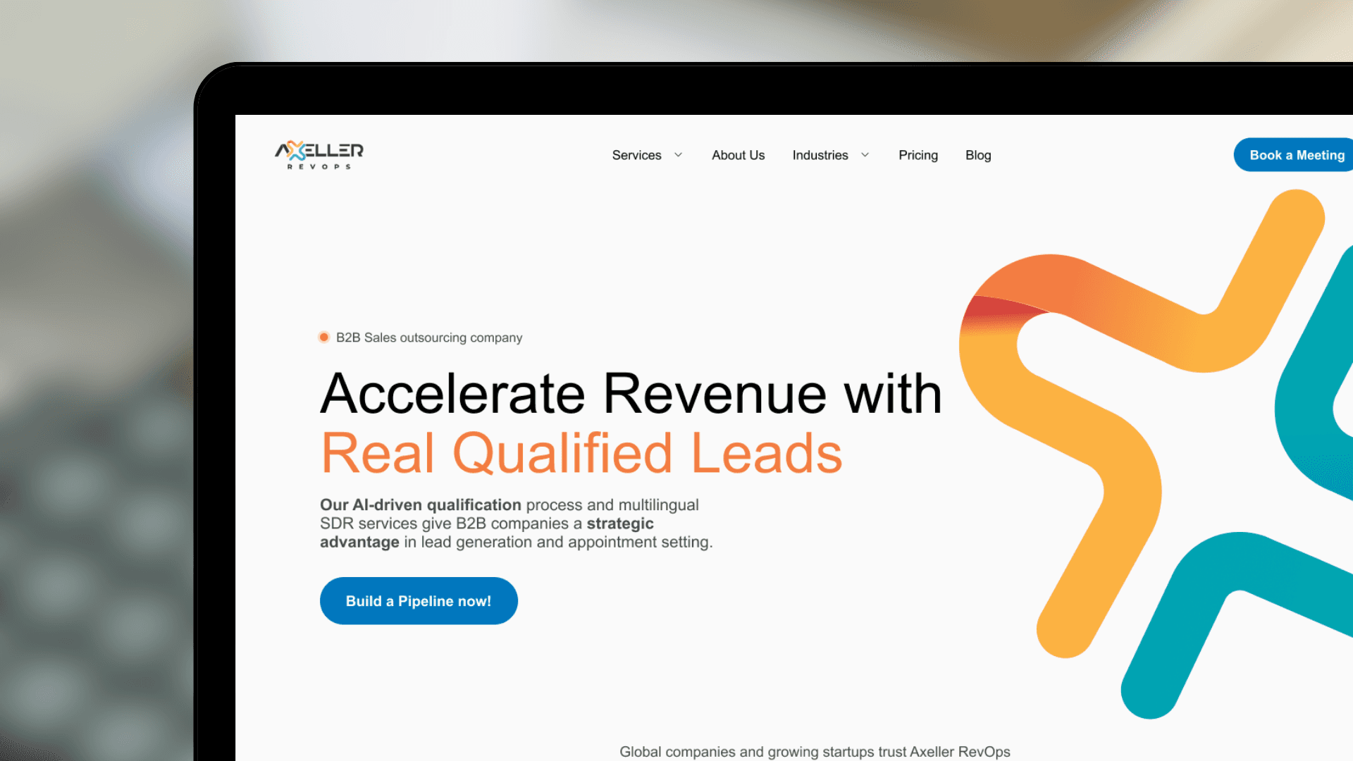
Rather than opening with a feature matrix, the hero section centers on the core brand idea — scaling without losing identity. This emotionally resonates with the target audience before presenting the specifics of what Axeller offers.
Rather than opening with a feature matrix, the hero section centers on the core brand idea — scaling without losing identity. This emotionally resonates with the target audience before presenting the specifics of what Axeller offers.
Rather than opening with a feature matrix, the hero section centers on the core brand idea — scaling without losing identity. This emotionally resonates with the target audience before presenting the specifics of what Axeller offers.
Premium visual tone to match the "premier" positioning
Premium visual tone to match the "premier" positioning
Color palette, typography, and spacing were deliberately elevated above typical SaaS or service websites. Every visual decision reinforces the message that Axeller is not a generic provider but a strategic partner worth trusting.
Color palette, typography, and spacing were deliberately elevated above typical SaaS or service websites. Every visual decision reinforces the message that Axeller is not a generic provider but a strategic partner worth trusting.
Color palette, typography, and spacing were deliberately elevated above typical SaaS or service websites. Every visual decision reinforces the message that Axeller is not a generic provider but a strategic partner worth trusting.
Friction-reduced conversion path
Friction-reduced conversion path
CTAs were placed at each key decision point in the scroll — not just at the bottom. The contact form was designed to be minimal and approachable, reducing the perceived commitment of reaching out.
CTAs were placed at each key decision point in the scroll — not just at the bottom. The contact form was designed to be minimal and approachable, reducing the perceived commitment of reaching out.
CTAs were placed at each key decision point in the scroll — not just at the bottom. The contact form was designed to be minimal and approachable, reducing the perceived commitment of reaching out.

The Result
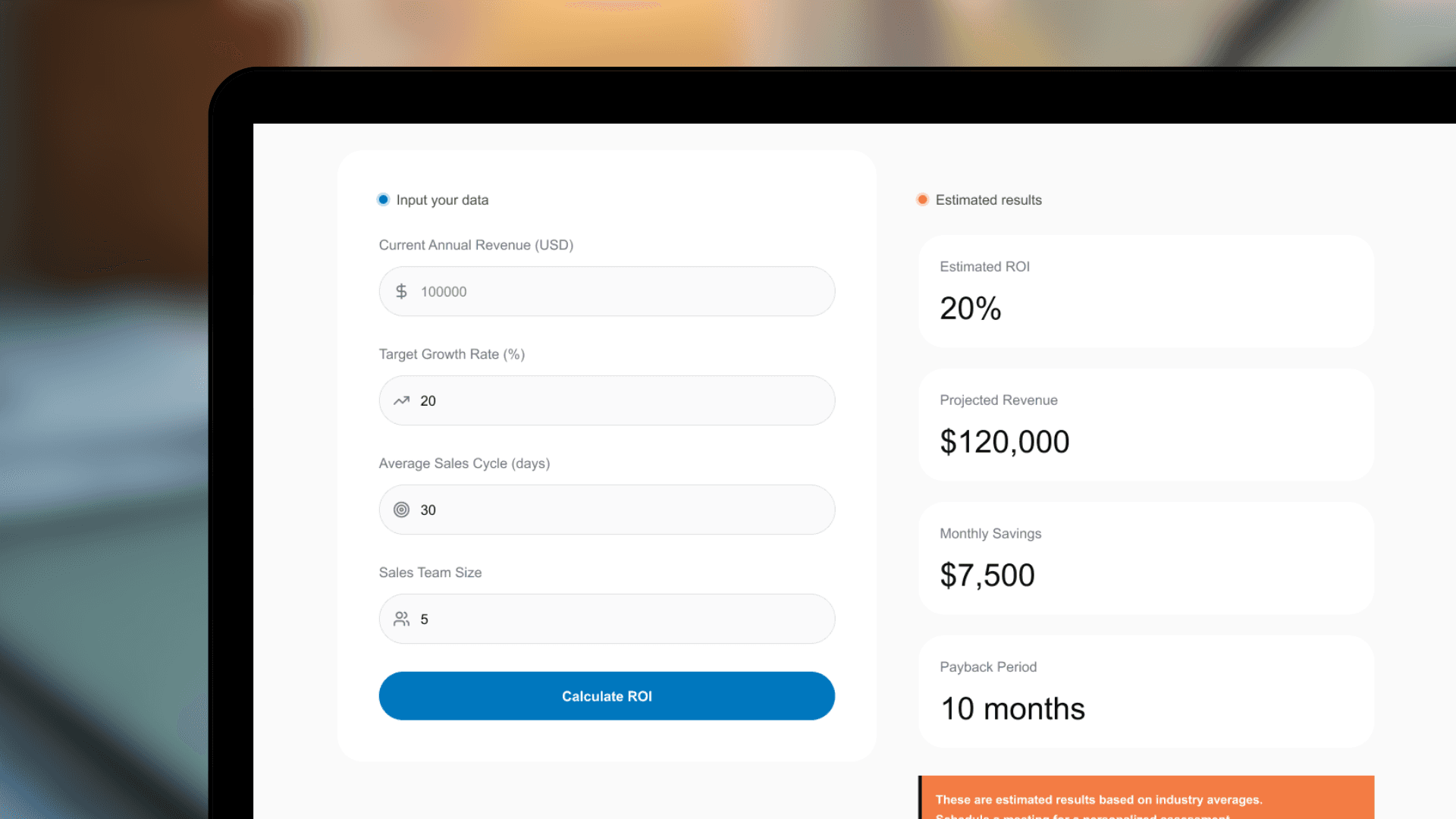
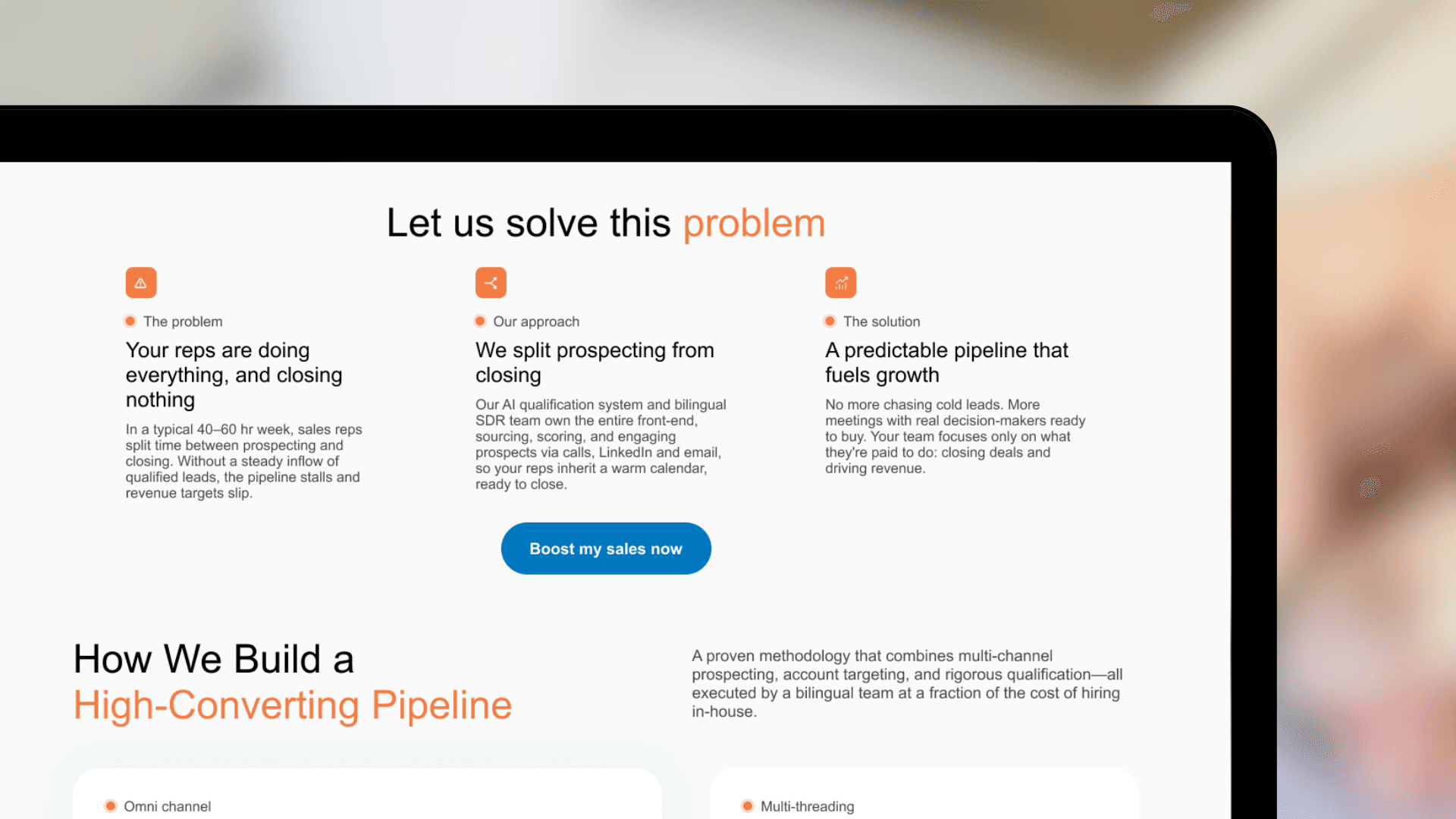
The final deliverable was a fully designed, interactive prototype in Figma covering the complete website — homepage, service pages, and contact. All screens were built with a consistent component library and are ready for responsive web development.
The final deliverable was a fully designed, interactive prototype in Figma covering the complete website — homepage, service pages, and contact. All screens were built with a consistent component library and are ready for responsive web development.
The final deliverable was a fully designed, interactive prototype in Figma covering the complete website — homepage, service pages, and contact. All screens were built with a consistent component library and are ready for responsive web development.
Outcome
Designing a corporate website for a service firm requires a different mindset than product design — the primary conversion is trust, not a feature. Every section needs to answer an implicit question the visitor is asking: "Can these people actually do what they're promising?"
This project reinforced the importance of message hierarchy: getting the value proposition right at the top of the page directly affects whether a visitor scrolls further or bounces. It also deepened my understanding of how visual tone communicates positioning even before a single word is read.
Designing a corporate website for a service firm requires a different mindset than product design — the primary conversion is trust, not a feature. Every section needs to answer an implicit question the visitor is asking: "Can these people actually do what they're promising?"
This project reinforced the importance of message hierarchy: getting the value proposition right at the top of the page directly affects whether a visitor scrolls further or bounces. It also deepened my understanding of how visual tone communicates positioning even before a single word is read.
Designing a corporate website for a service firm requires a different mindset than product design — the primary conversion is trust, not a feature. Every section needs to answer an implicit question the visitor is asking: "Can these people actually do what they're promising?"
This project reinforced the importance of message hierarchy: getting the value proposition right at the top of the page directly affects whether a visitor scrolls further or bounces. It also deepened my understanding of how visual tone communicates positioning even before a single word is read.